


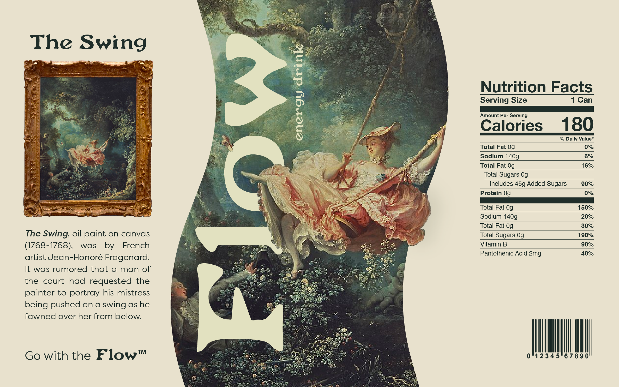
I wanted Flow to stand out from competitors by combining two seemingly opposite concepts. Integrating historical artwork with energy drinks, Flow both energizes and educates. The name derives from three things: the state of flow artists enter when focused, the flow you gain from energy drinks, and the flow of liquid itself, of course.


Research
While researching competing energy drink companies, I found their branding concepts to be relatively one-dimensional. The main focus surrounded around how much energy you gain from consuming their product, but I wanted to push further than this. During this process, I also found inspiration from Liquid Death, a water company with the packaging style of beer. They were able to morph two distinct concepts together in a clever way.
The goal: to successfully combine two opposing concepts while promoting the overall benefit of energy drinks.


Moodboards
After much contemplation, I settled on the combination of energy drinks with artwork. I’ve always been passionate about art from a young age and knew this was the perfect opportunity to incorporate something I love into a project. My original concepts consist of three different approaches: sketchy and playful, classic and regal, and bold and bright. I ended up choosing the first one to move forward with as my idea was to lean into the primary colors as it is a basic concept of art. I also went ahead with the second one since the contemporary aspect intrigued me as it had a similar elegance to historical artwork.
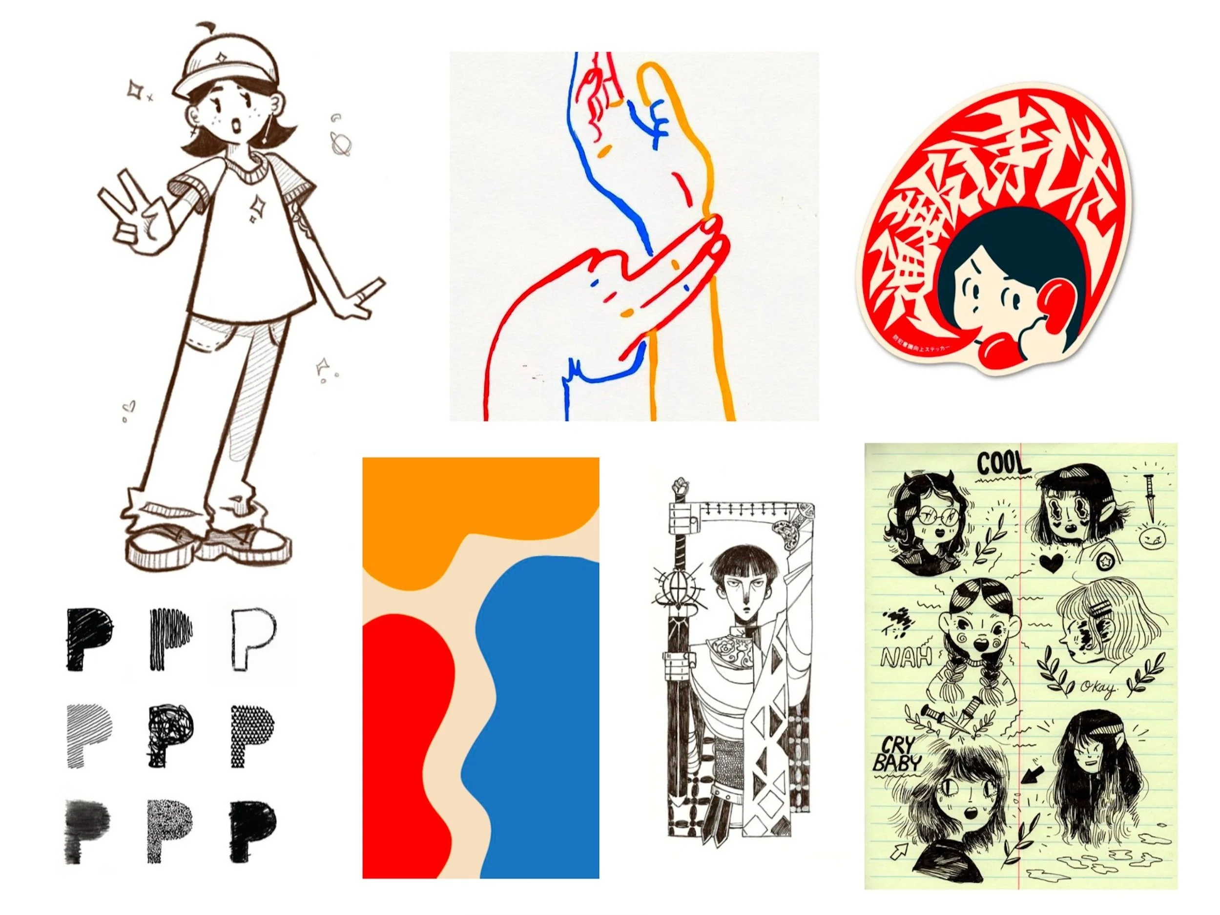


Sketches
I incorporated famous artworks into my design by using stylistic choices from moodboards 1 and 2. I took inspiration from various art periods and used a wide scope of artists from Monet, Vermeer, and Keith Haring. I also thought it would be interesting to include the full piece and some information about the art utilized.

To incorporate the “flow” aspect and dimensionality, I included the wave shape with the highlighted painting popping out of it. The addition of the full painting and description provides context and educates the consumer about the painting’s origin. All of these aspects together turn the design from simple can packaging into a collectable.
Can Design


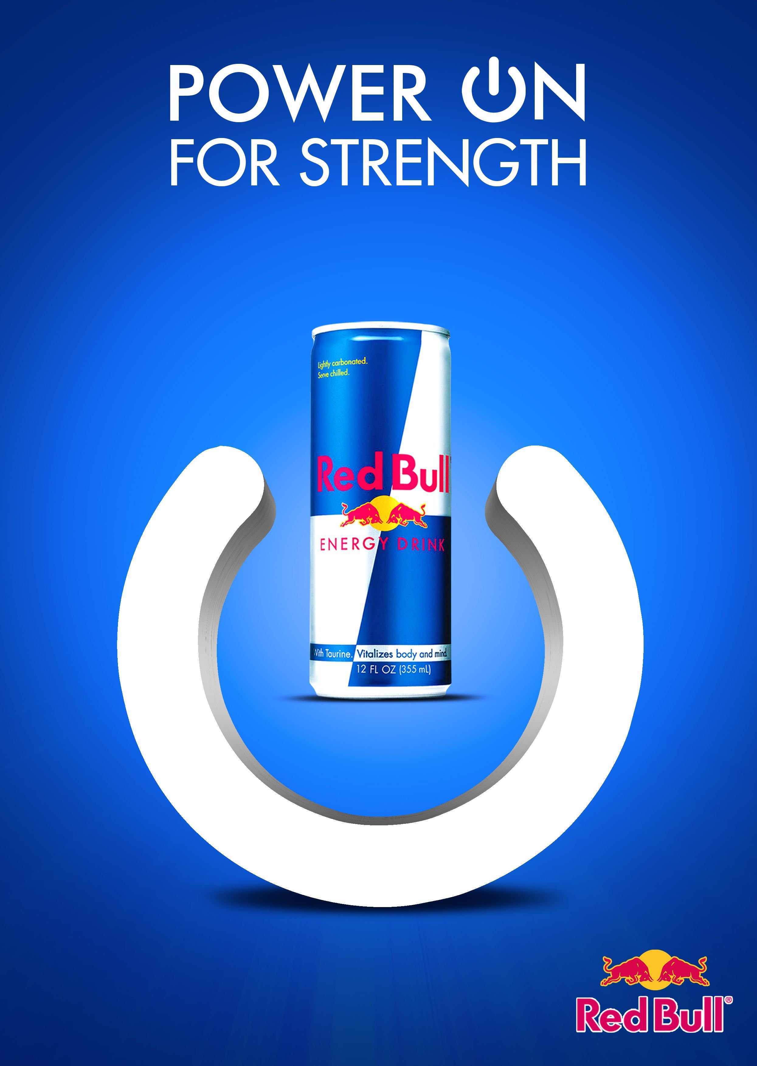
Advertisement Design
I wanted to incorporate fun slogans in these advertisements that could be consistently utilized. The combination of playful visuals and amusing quips make the design feel less “corporate” and more personable. All of these aspects together complete the overall goal of connecting two opposing concepts.


