


Florence, being the birthplace of the Renaissance, encompasses what Italian culture is all about. In order to promote the city, I researched Italian architecture and art to incorporate into the branding identity. I questioned how I could combine historical aspects with contemporary elements to create something fresh.


Interactive Prototype
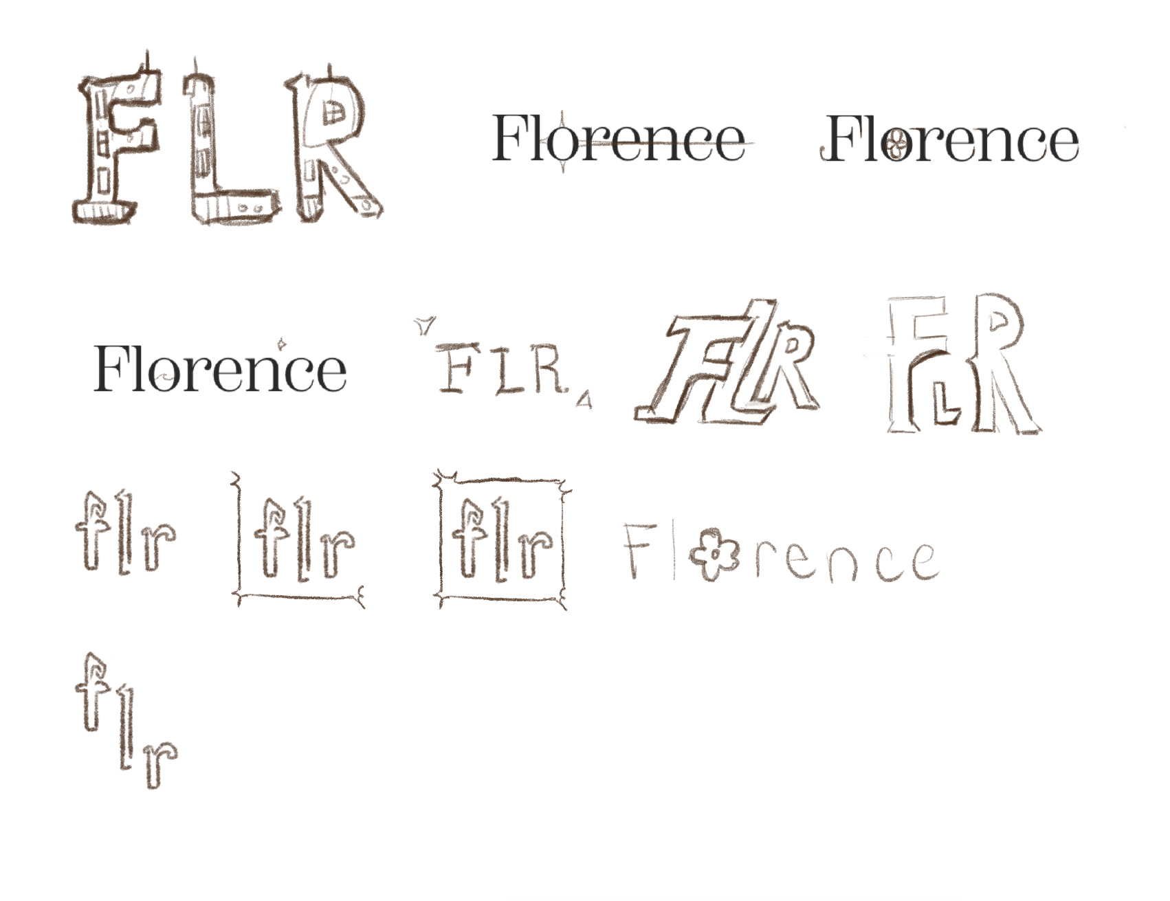
Beginning Process
After researching the origin and significance of Florence, I created a moodboard based off what I found to be most important. I included the Duomo, an iconic building that marked the growth and transition of Florence. Florence also means flourish, so incorporating that sentiment into my design was crucial. I focused on architecture and aspects of growth in my initial sketches and refined them digitally.
The goal: to create a branding identity that successfully reflects Florence’s history and aesthetics.

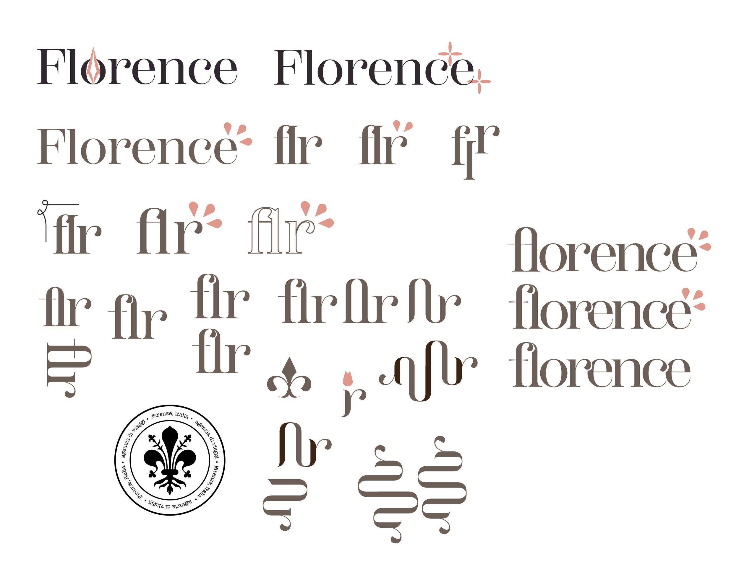
Final Logos

I used an elegant serif typeface and manipulated it to overlap, similar to Italian architecture which tends to be close in proximity. The swooping lines are also similar to a plant, connecting the flourishing concept to the design. I also made a shortened logo since Florence’s airport code is “flr”.
Motif
I found my initial touchpoint designs to be lackluster and clunky since there was little connection between elements. I experimented with ways I could join the information to be more cohesive. After playing around for solutions, I landed on creating a motif from the shortened logo! This resulted in three different graphics to be used throughout the branding. The flower references the growth concept, the middle graphic is used as an interesting visual element, and the right graphic is my version of Florence’s widely-known symbol known as the “fleur de lis”.

Website
I designed the website to be user friendly and eye-catching with simple navigation and complimentary colors. I also included high quality images that were aesthetically appealing and matched the color palette. The motif also connects each informational element, making the website more coordinated. Overall, the design meets the goal by referencing Florence’s history and visual style.

Brochure
The brochure includes information highlighting the best aspects of Florence. I wanted the information to start as soon as you opened it, ultimately flowing from one point to the next.

