


Keshi is a singer and songwriter best known for his R&B alternative music. This promotion design emulates certain aspects from Keshi’s existing branding identity while incorporating new characteristics from his recent album titled “Gabriel”.


Research
I took visual inspiration from Keshi’s social media, website, and personal branding. I found his aesthetic to be contradictory as his website used clean visuals and negative space, while his social media and logo were crowded and “messy”. The album name also derives from Gabriel the angel, signifying the dynamic between hell and heaven.
The goal: integrate details from the existing branding to create a completely new design while maintaining the album’s integrity.


Sketches
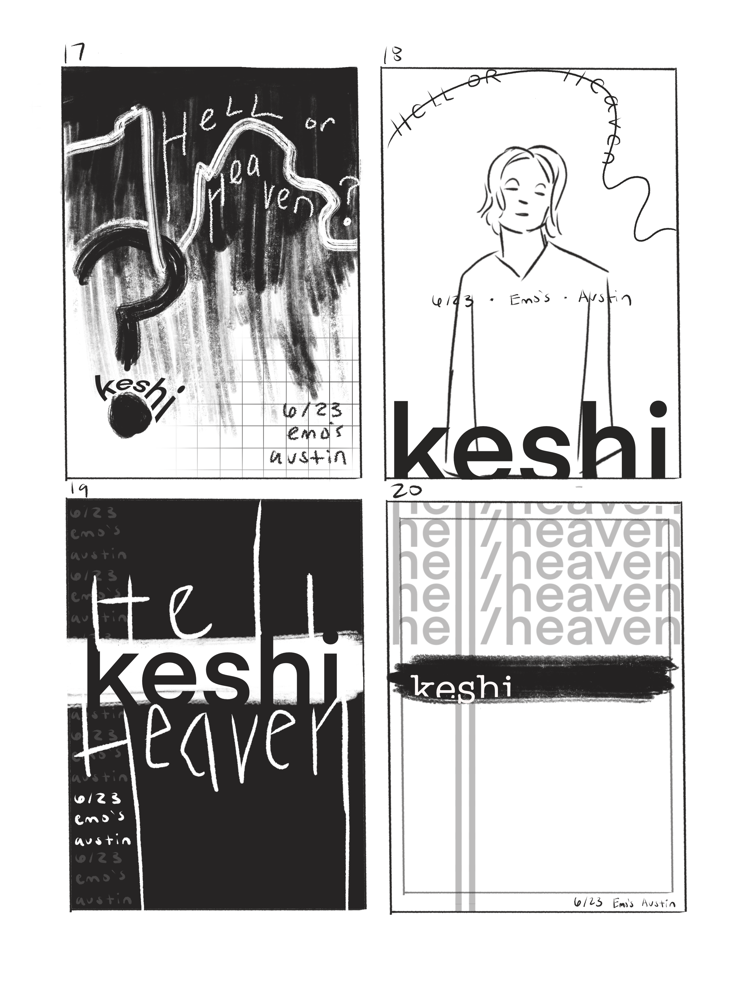
After researching Keshi’s music and visual identity, I started sketching concepts that had a variety of photography and graphic focal points. I kept my main goal in mind by integrating references to specific album songs. I also experimented with contradictory elements, such as messy typefaces coinciding with clean ones.


Drafts
I ran into a couple problems with my initial drafts. I tried to use complimentary typefaces but found them to clash too much, as well as seeming a bit outdated. I enjoy the color choices as they feel similar to the original branding, but it still seemed too “safe”. I also wasn’t satisfied that there wasn’t enough connection to the album itself and the concept of “Gabriel”.


Final Flats
Using new typefaces, updating the color palette, and incorporating extra touchpoints ultimately enhanced the branding identity. After thinking of ways to include Keshi’s sentiment of the album, I settled on utilizing a blackletter typeface that ties in the old bible concept. The mix of negative space with purposeful clutter also refers back to his original branding, accomplishing the overarching goal.


